
柱形图&折线图
import matplotlib.pyplot as plt

list_year = [2006,2007,2008,2009,2010,2011,2012,2013,2014,2015,2016,2017]
list_gdp = [219438.50,270232.30,319515.50,349081.40,413030.30,489300.60,540367.40,595244.40,643974.00,689052.10,744127.20,827122.00]
plt.bar(list_year,list_gdp)#柱形图
plt.plot(list_year,list_gdp)#折线图
plt.title('gdp amount from 2006 to 2017')
plt.xlabel('year')
plt.ylabel('gdp')
plt.show()
结果:

饼图
#定义一个字典
   gdp_2017={
'primary industry':65468,
'secondary industry':334623,
'tertiary industry':427032
}
#取出gdp的类别列表和gdp列表
labels=gdp_2017.keys()
values=gdp_2017.values()
import matplotlib.pyplot as plt
#设置图形大小
plt.figure(figsize=(6,6))
#画图
#startangle表示起始角度
plt.pie(values,
        labels=labels,
        autopct='%.1f%%',
        startangle=90
        )
#设置样式扁平
plt.axis('equal')
#显示图例
plt.legend()
#显示图片
plt.show()
结果:

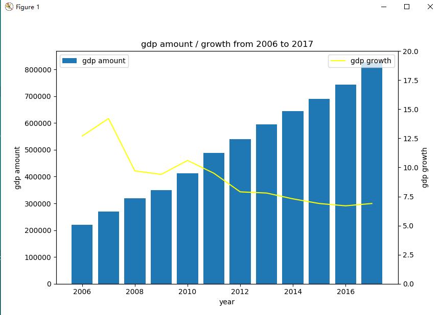
双坐标轴图形
#准备数据
list_year = [2006,2007,2008,2009,2010,2011,2012,2013,2014,2015,2016,2017]
list_gdp  = [219438.50,270232.30,319515.50,349081.40,413030.30,489300.60,540367.40,595244.40,643974.00,689052.10,744127.20,827122.00]
list_gdp_growth = [12.70,14.20,9.70,9.40,10.60,9.50,7.90,7.80,7.30,6.90,6.70,6.90]
import matplotlib.pyplot as plt
#设置大小
fig=plt.figure(figsize=(8,6))
#画柱状图
ax1=fig.add_subplot(1,1,1)
ax1.bar(list_year,list_gdp,label='gdp amount')
ax1.legend(loc='upper left')
ax1.set_xlabel('year')
ax1.set_ylabel('gdp amount')
#画折线图
ax2=ax1.twinx()#关键设置
ax2.plot(list_year,list_gdp_growth,color='yellow',label='gdp growth')
ax2.legend(loc='upper right')
ax2.set_ylabel('gdp growth')
ax2.set_ylim(0,20)
# 标识标题及坐标轴信息
plt.title('gdp amount / growth from 2006 to 2017')
plt.show()
结果:
同时显示多幅子图
list_year = [2006,2007,2008,2009,2010,2011,2012,2013,2014,2015,2016,2017]
list_gdp  = [219438.50,270232.30,319515.50,349081.40,413030.30,489300.60,540367.40,595244.40,643974.00,689052.10,744127.20,827122.00]
list_gdp_growth = [12.70,14.20,9.70,9.40,10.60,9.50,7.90,7.80,7.30,6.90,6.70,6.90]
import matplotlib.pyplot as plt
#使用默认字体,图例设置为仿宋
#import matplotlib.pylab as mpl
#mpl.rcParams['font.sans-serif']=['FangSong']
fig=plt.figure(figsize=(8,6))
#画柱状图
ax1=fig.add_subplot(2,1,1)
#若为左右结构一行两列第一个
ax1=fig.add_subplot(1,2,1)
ax1.bar(list_year,list_gdp,label='gdp amount')
ax1.legend(loc='upper left')
ax1.set_xlabel('year')
ax1.set_ylabel('gdp amount')
ax1.set_title('gdp amount from 2006-2017')
#画折线图
ax2=fig.add_subplot(2,1,2)#关键设置
#左右结构一行两列第二个
ax2=fig.add_subplot(1,2,2)
ax2.plot(list_year,list_gdp_growth,color='yellow',label='gdp growth')
ax2.legend(loc='upper right')
ax2.set_ylabel('gdp growth')
ax2.set_ylim(0,15)
ax2.set_title('gdp growth from 2006-2017')
ax2.grid(True)
#调整子图之间的间距
plt.tight_layout()
plt.show()
结果